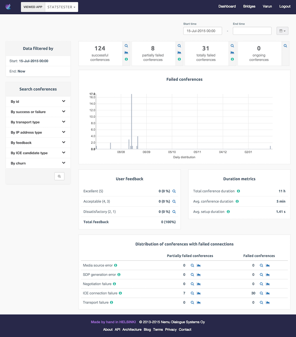
Yesterday, we released an update to the callstats.io dashboard. Now it callstats.io users can see an overview of app-level metrics trends. The screenshot below shows the redesigned app-level metrics page. Read on to see what has changed.

The new app-level metrics page with a trend graph
Layout
When designing the page, we strived to keep the most importants bits of information at the top of the page. Conferences have been split into three categories:
- conferences where all connections are successful.
- conferences where some connections failed to set up.
- conferences where all connections failed and the conference was not established as a result.
These three metrics as well as ongoing conferences are placed at the top of the page, just above the trend graph because together they provide a quick overview of the state of the WebRTC application or service.
Another guideline for us is to add more visual hierarchy of the data we display. This is why similar metrics are now placed into their own containers, which also have a distinct look and feel. The less timely metrics for customer feedback and different time durations are placed immediately below the trend graph. Furthermore, the breakdown of reasons why the conference failed are placed at the bottom of the page.
The time filter applies to everything that is beneath it, making top of the page a natural place for it. Additionally, being at the top of the page the time filter does not interfere with the actual metrics keeping the main part of the dashboard focused on the metrics.
Time filters

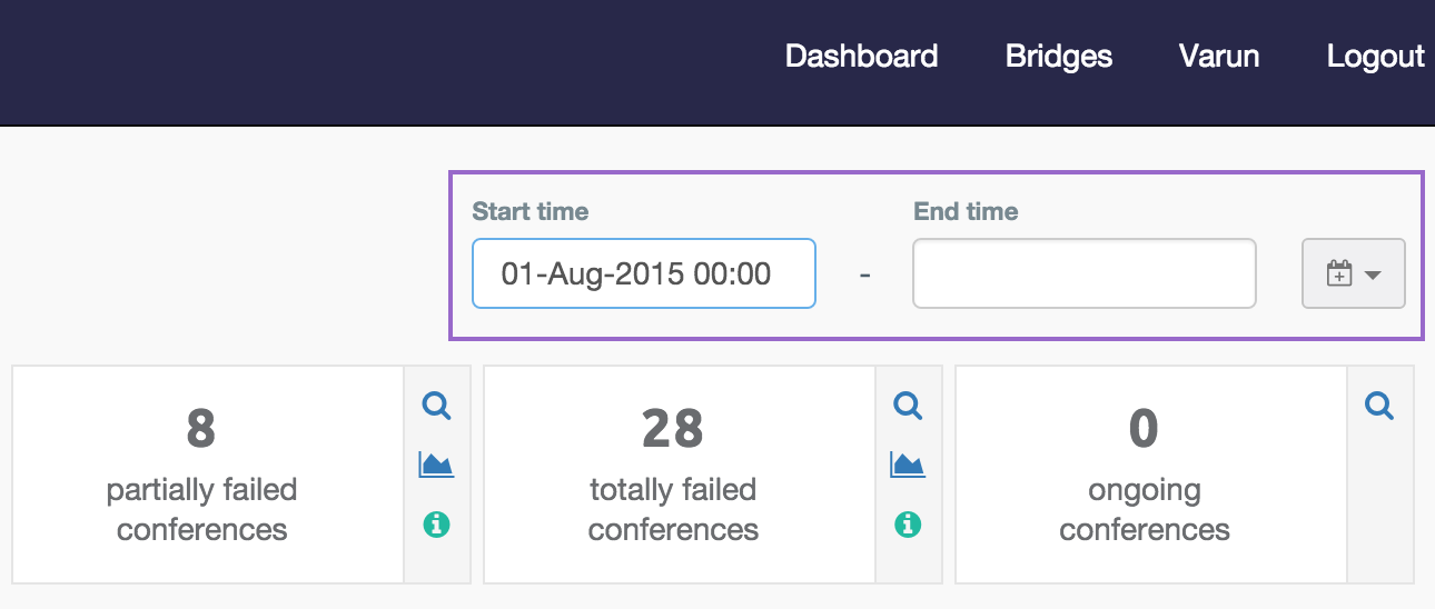
The new time filter
At the top of the page you can find the new time filter. Unlike before, there is now a possibility to create a custom time filter using the start and end time fields. It is also possible to only fill one of the time fields to, for example, look at conferences from last 3 days.

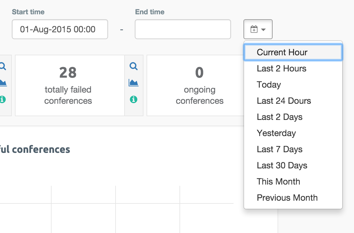
Predefined time filter values
Previously the time filter included solely predefined values. Since we wanted to add a custom time filter and keep the look on the page simple, it was best to move the predefined time filters to a dropdown menu, however, adding an extra click to access them. When a predefined time filter is used the start time field will show the used date and time information.
Icons
Earlier clicking on a row or a number would search conferences with the selected criteria, for example, show ongoing conferences. Now any of the app-level metrics, which has the -icon next to it, can be visualized in the trend graph by clicking the graph icon. Using the -icon shows a list of conferences with the selected criteria. We have also added some -icons to give users an easy access to help.
![]()
New icons
We added these icons to act as visual clues for the action they represent, but pictures only get you so far. If you’re in doubt of what the icon signifies, you can always hover your cursor over the icon and get a tooltip with a text description.
The React magic
We wrote a blog post last fall about selecting a new front-end framework for the dashboard. We eventually picked React, as it fit our vision of the dashboard flawlessly. Further, React allows introducing features gradually, and over the past 4 months, we have been working hard at “reactifying” our dashboard.
When making this redesign using React helped us in many ways. Our previously packed (and slightly messy) Django monolithic template file is now almost empty and our React components are neatly stored as separate files in relevant folders. Updating parts of the page is super-easy and just the initial page load is static.
We also make good use of the brilliance of react-bootstrap - the only problem is to remember that <row> is not a valid HTML element when writing regular HTML instead of JSX. :-)
Conclusions
The new dashboard is in production and all callstats.io users have access to it. We hope you enjoy using our dashboard as much as we enjoyed developing it. If you have any questions or comments about the update, please email us at support-[at]-callstats.io.


